
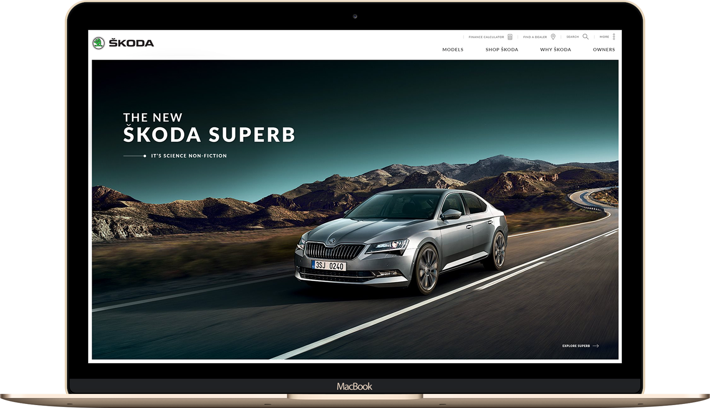
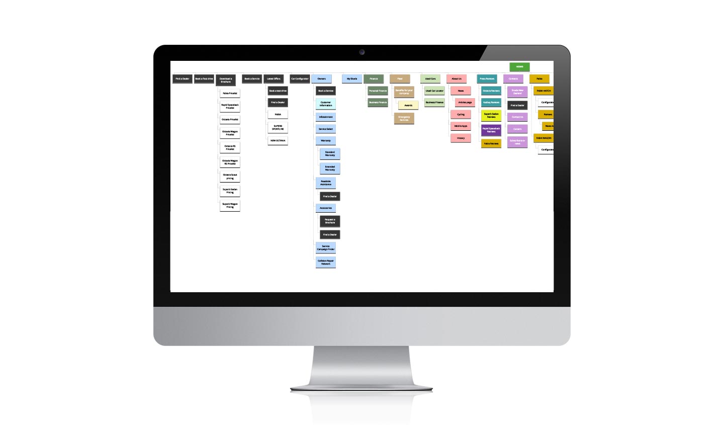
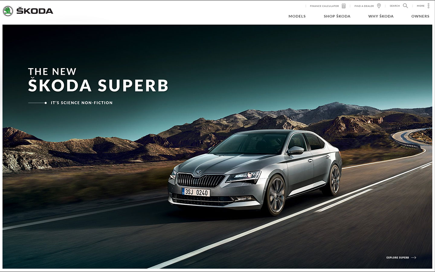
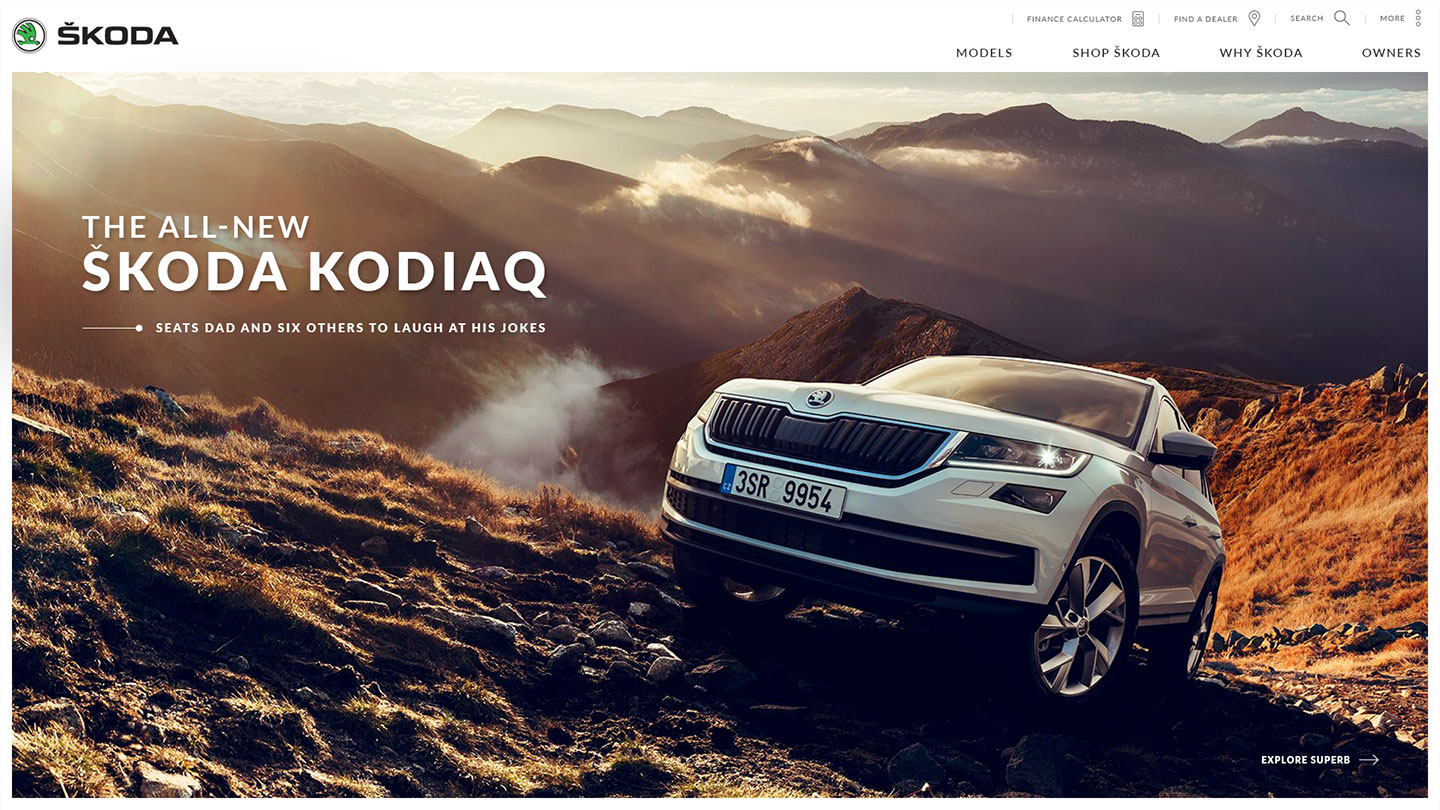
ŠKODA NZ came to us to get a refreshed look and feel for thier New Zealand website. After identifying some initial pain points, we designed & created a prototype for a proposed new navigation experience, highlighting new vehicles.
ŠKODA NZ Proposal
Motion design and prototyping for a new navigational user journey.
ŠKODA Motion Design
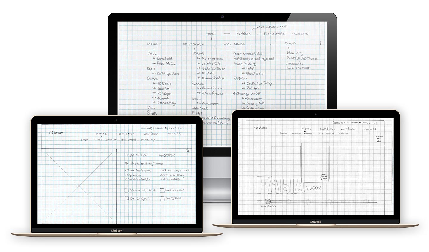
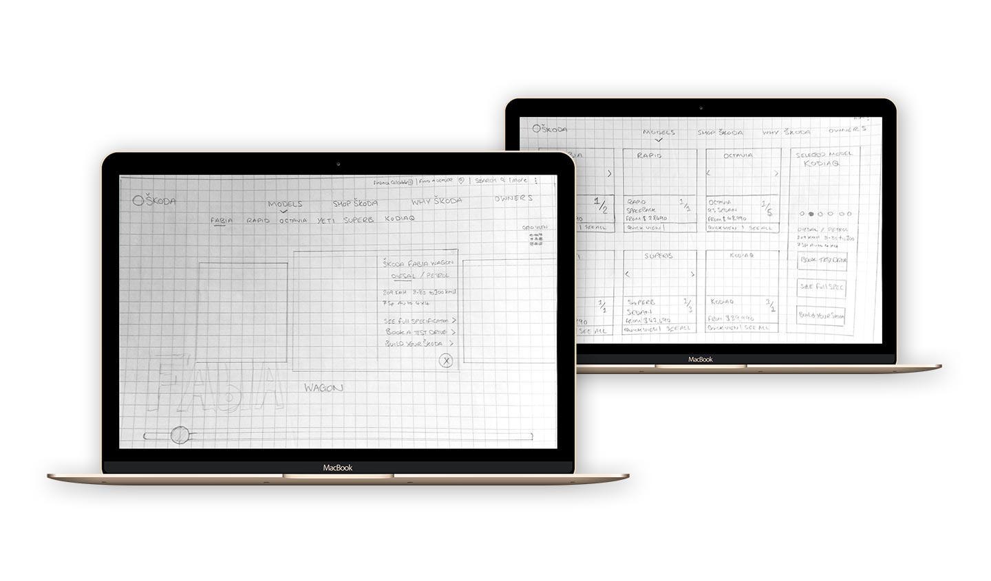
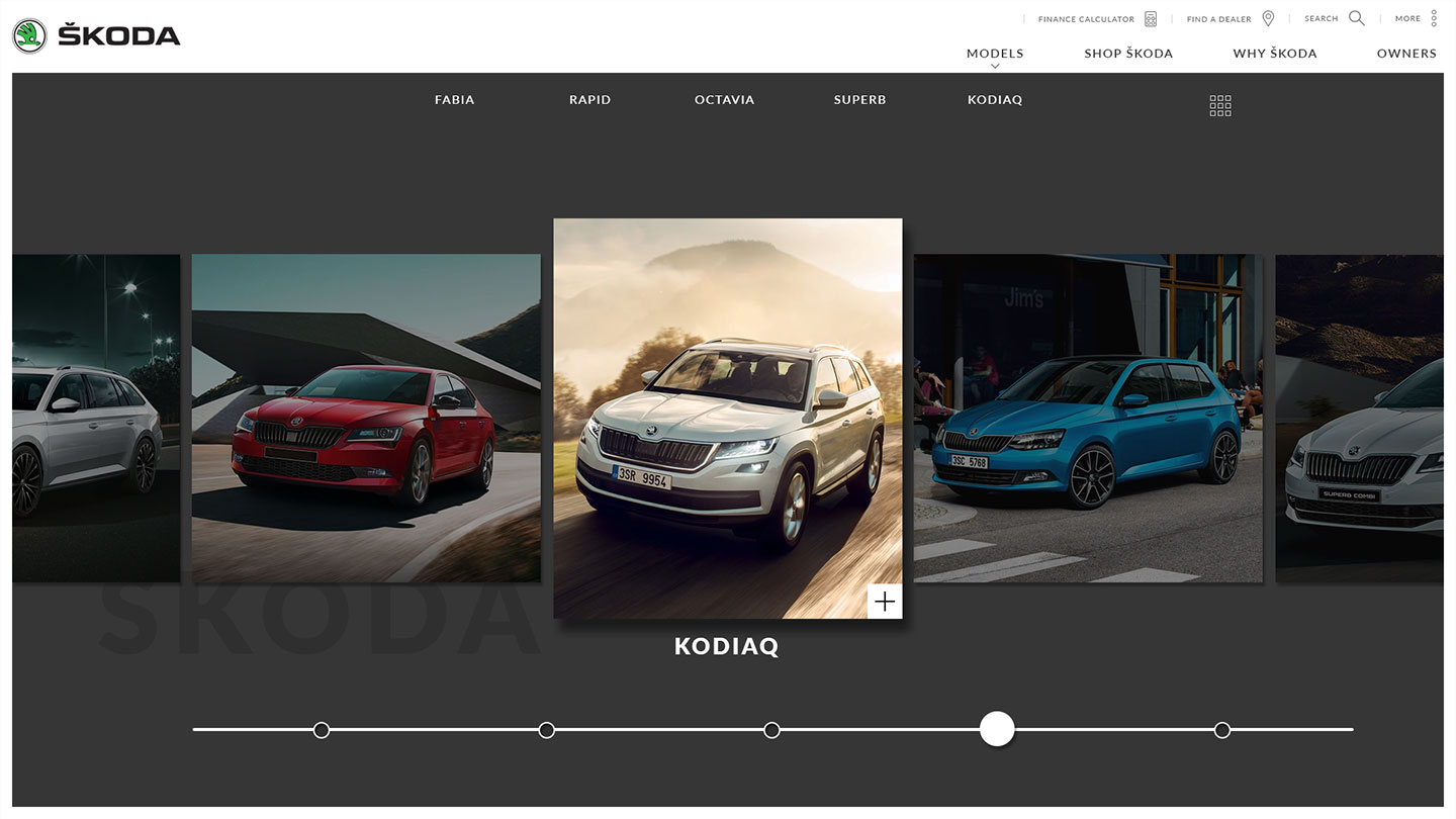
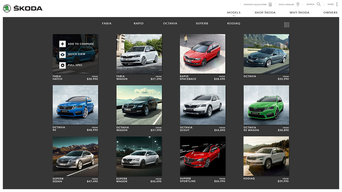
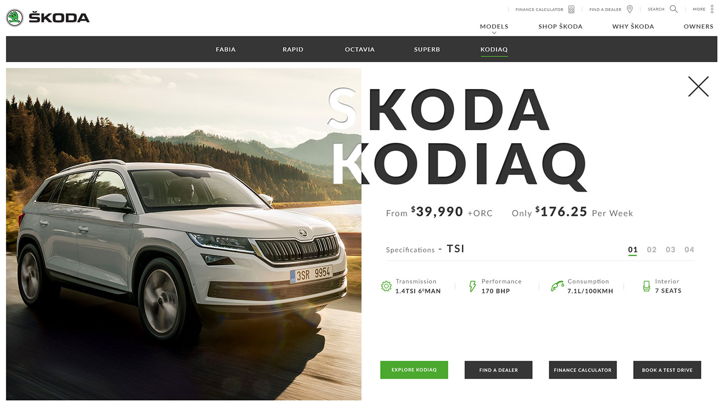
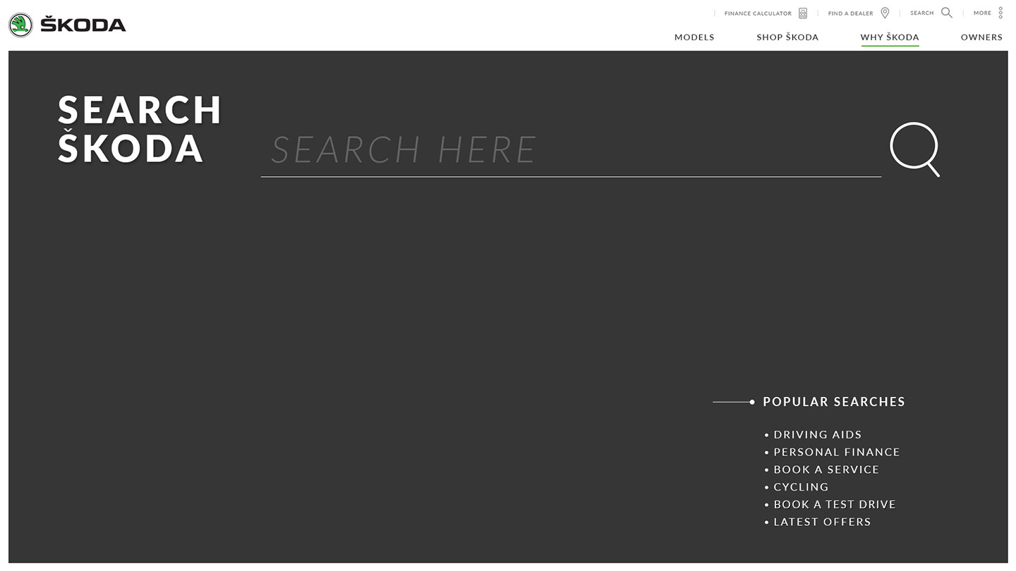
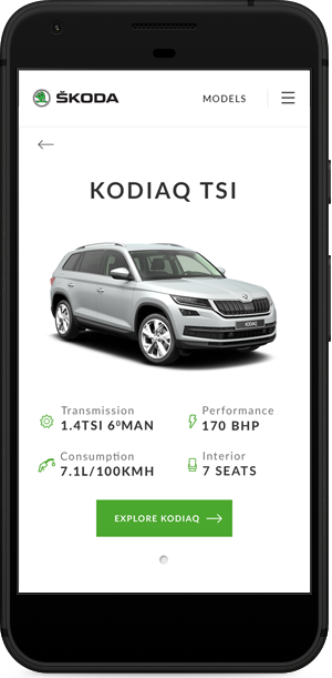
We created a custom prototype to showcase how easily a user could navigate through the menu to a specific vehicl model with ease. We created a quick view feature to allow for model features to be displayed without having to dig too deep into the site on first visit.
Flexibility
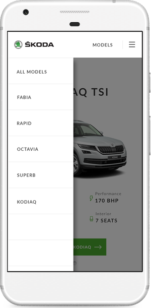
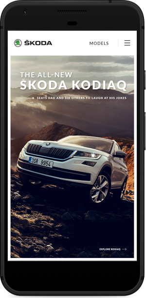
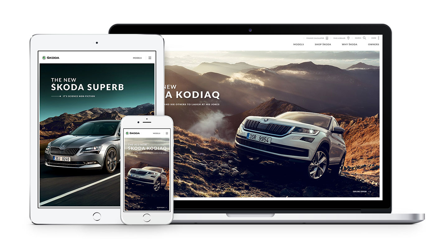
The site was designed from a mobile first point of view, to allow for complete scalability across multiple device sizes.
The navigation was simplified for smartphone view to allow a much more frienldy user experience.
The content and media has to create a smooth experience for every user, it should be understandable, easy and intuitive.
User experience is more important than ever in today's digital age, and with more searches now performed on mobile than desktop, the need for a mobile-friendly site is imperative to a business’ success.
We ensure all our products engage the users no matter the screen size.
Engagement
Like What
We Do?
Get In Touch